How Accessible Checkouts Improve Ecommerce Conversion Rates
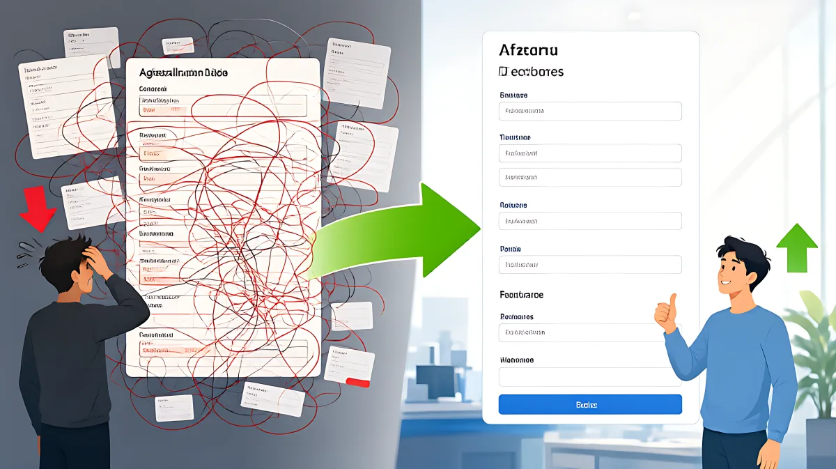
Cart abandonment often stems from friction that blocks users with disabilities. By fixing labels, errors, and keyboard navigation, you create a smoother flow that increases sales for all shoppers.
Cart abandonment is frequently a symptom of poor accessibility rather than just pricing or delivery costs. By removing barriers that frustrate users with disabilities, you eliminate friction for everyone, which directly improves conversion rates. Current research suggests that the average cart abandonment rate stands at 70.22%, according to the Baymard Institute. Fixing accessibility issues in your checkout flow is one of the most effective ways to recover lost revenue and meet legal standards like the European Accessibility Act.
Why Accessible Checkouts Directly Impact Revenue
Many teams treat accessibility as a purely legal obligation, owned by engineering or legal departments. However, the specific technical fixes required for accessibility are identical to the user experience optimizations that drive sales. When a form field lacks a proper label, it is invisible to screen readers. It is also less likely to be auto-filled by modern browsers on mobile devices. By ensuring every input has a programmatic label, you help users with assistive technology while also reducing the typing effort for all shoppers, which speeds up the completion process.
What Is the Cost of Ignoring Accessibility?
Ignoring these requirements exposes your brand to legal risk and lost customers. In the United States, the Centers for Disease Control and Prevention estimates there are approximately 61 million adults with disabilities. If your checkout flow blocks these users, you are excluding a significant portion of your potential market. Furthermore, plaintiff attorneys often target checkout processes specifically because failure here constitutes direct harm—a customer who cannot buy a product has a stronger legal case than one who cannot browse a page. The Baymard Institute notes that clearing out user experience problems can lift checkout conversion by roughly 35%. This figure highlights that the same effort required to pass an accessibility audit can yield substantial financial returns.
How to Identify Friction Points in Your Flow
Before making changes, you need to understand where users get stuck. The most common friction points are hidden in plain sight because they work perfectly for the designer using a mouse and keyboard, but fail for everyone else. You should test your checkout as if you are a user who cannot see the screen or cannot use a pointer. If the process is difficult for you, it is impossible for many of your customers.
What Are the Most Common Accessibility Mistakes?
Many designers assume that a visual red border is enough to signal an error. In fact, this is a major misconception. Users relying on screen readers or those with color blindness cannot distinguish a red border from the rest of the interface. The error must be announced in text, linked to the specific field, and describe how to fix it. For example, instead of showing a generic "Invalid input" message, specify that the card number is missing one digit. This clarity turns a potential exit into a retry, keeping the shopper engaged.
Key Design Principles for High-Converting Accessible Checkouts
To optimize your flow, you must adhere to several structural standards. These principles align with WCAG 2.1 Level AA criteria and general usability best practices.
How Should Form Fields Be Structured?
- Use Persistent Labels: Every input needs a visible label placed above the field. Do not rely on placeholder text, which disappears when the user starts typing. The label must remain visible so the user knows exactly what data is being entered.
- Minimize Fields: Reduce the cognitive load by only asking for what is strictly necessary. Default the billing address to match the shipping address. Hide optional fields like "Address Line 2" behind a toggle or link to keep the interface clean.
- Ensure Logical Tab Order: Users must be able to navigate the entire form using only the Tab key. The focus must move in a predictable, visual order from top to bottom and left to right. If the focus jumps randomly, users will lose their place and abandon the cart.
What Makes Error Messages Effective?
Error handling is the most critical recovery point in the checkout. A good error message tells the user three things: what went wrong, how to fix it, and where the problem is located. Use ARIA live regions to announce errors to screen readers. Visually, use icons or bold text in addition to color to indicate validation failure. This ensures that the message is perceivable by all users. When a user makes a mistake, they should not feel punished or confused; they should be guided toward the solution so they can complete the purchase.
Practical Checklist for Your Checkout Audit
Run through this checklist to verify your checkout is accessible and optimized for conversion. These steps align with the requirements of the European Accessibility Act and general best practices.
- Keyboard Test: Complete the entire purchase flow using only your keyboard. Ensure that modals and payment iframes do not trap focus or break the tab order.
- Screen Reader Simulation: Use a screen reader to navigate the page. Confirm that every button, input, and image has a clear label. If a screen reader says "Unknown button" or "Image without text," that is a drop-off risk.
- Contrast Check: Verify that text and interactive elements have sufficient contrast against the background. Faint grey-on-white text is a common accessibility failure that also hurts conversion for older users in bright lighting.
- Error Clarity Review: Intentionally enter bad data into every field. Check that the error message is specific, actionable, and visible to assistive technology.
- Mobile Usability: Test on a small mobile device. Ensure that buttons are large enough for thumbs and that autofill works correctly for address and payment fields.
Frequently Asked Questions
Does making the checkout accessible slow down the code performance?
No, accessibility changes such as adding proper labels, fixing tab order, and writing clear error messages do not negatively impact page load speed. In fact, reducing the number of form fields and using smart defaults can decrease the amount of data entered, which speeds up the user's interaction time. The primary goal is removing friction, not adding complexity.
Which legal standards apply to ecommerce checkouts in Europe?
The European Accessibility Act, which began enforcement in 2025, requires digital products and services sold to EU consumers to meet the EN 301 549 standard. This standard incorporates WCAG 2.1 Level AA for web content. It applies to any company selling into the EU market, regardless of where they are headquartered, with some exemptions for very small microenterprises.
How can I test if my error messages are accessible?
You can test error messages by disabling JavaScript to see if the form still functions, and by using a screen reader to confirm that the alert is announced immediately when an error occurs. Visually, ensure the message is not solely color-coded. Use text that clearly explains the issue, such as "Please enter a valid email address" rather than just a red outline. This ensures the message is understandable to users who cannot perceive the visual cue.
Why is guest checkout important for accessibility?
Guest checkout reduces the number of steps and the amount of information required, which lowers the cognitive load for all users. For users with disabilities, every additional form field represents a potential point of failure or frustration. By making guest checkout the default path and deferring account creation to after the purchase, you remove significant friction and increase the likelihood of conversion.